 12345
12345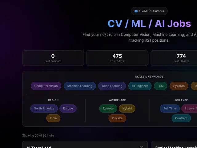 1234
1234The AI purple
331Look for violet or indigo carrying the page: a blue-to-purple gradient on the hero, headline or main button, purple pills and active states, and a faint glow around cards on a near-black background.
“The second one is because this purple blue gradient is right now considered the em dash of UI.”open comment
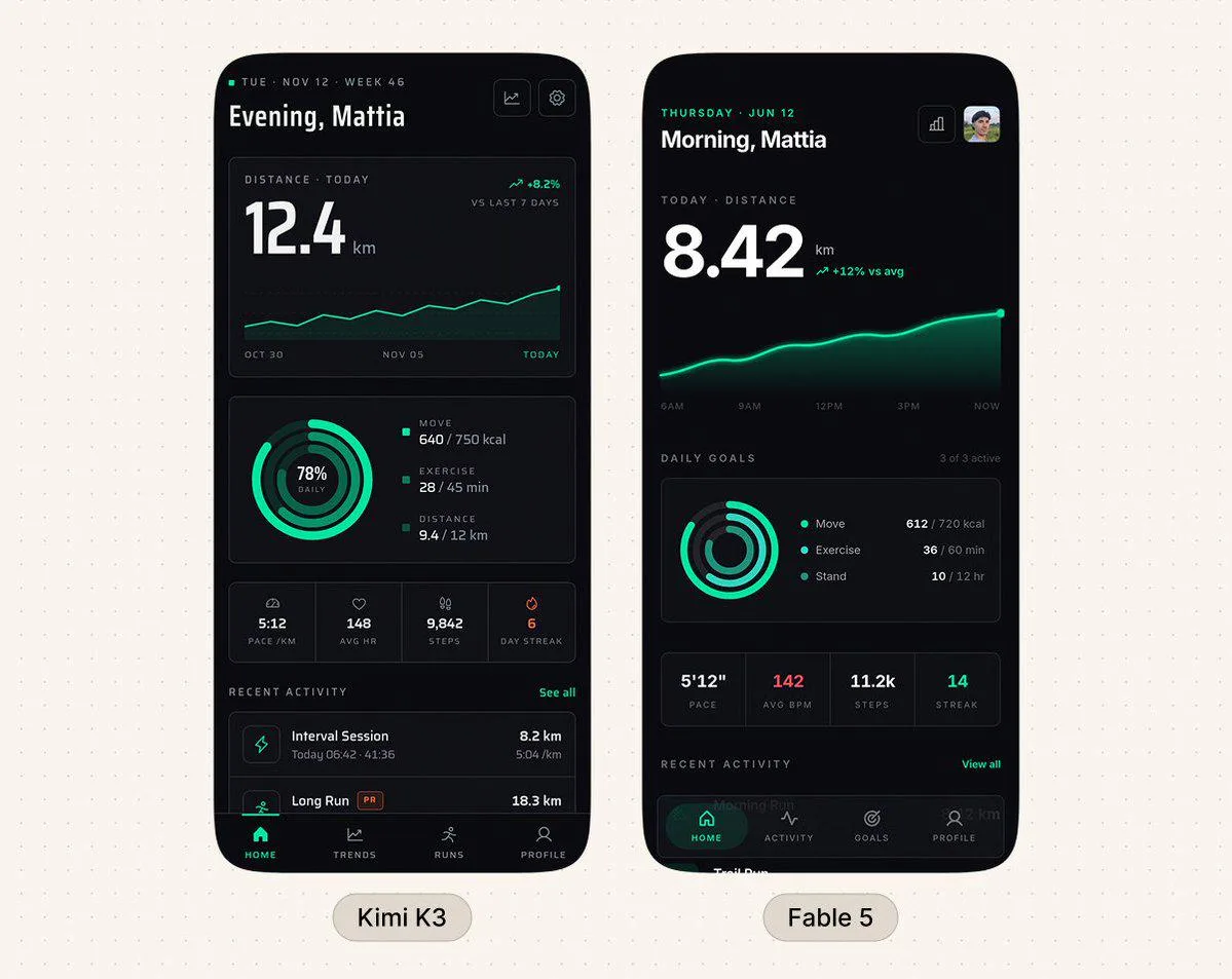
Not to be confused with Claude's newer warm look · Generic shadcn/Tailwind dark dashboard · Emerald/teal 'skills' look
Open the evidence
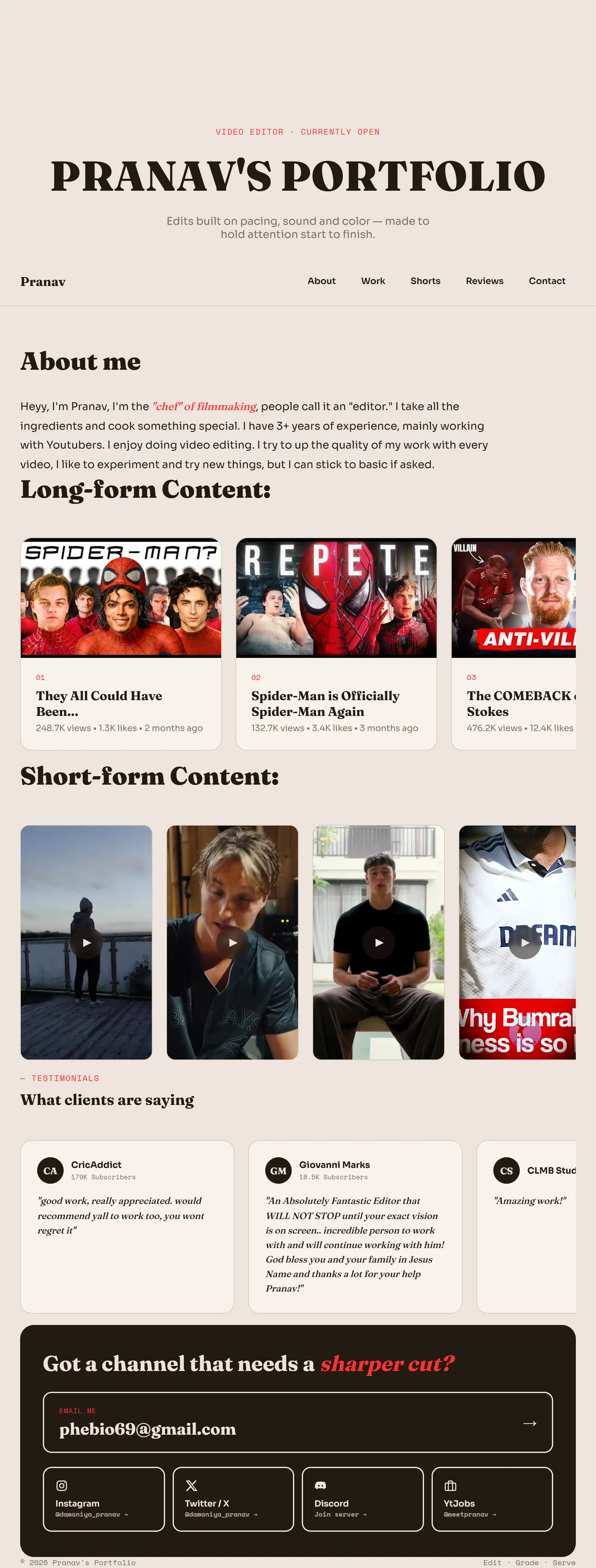
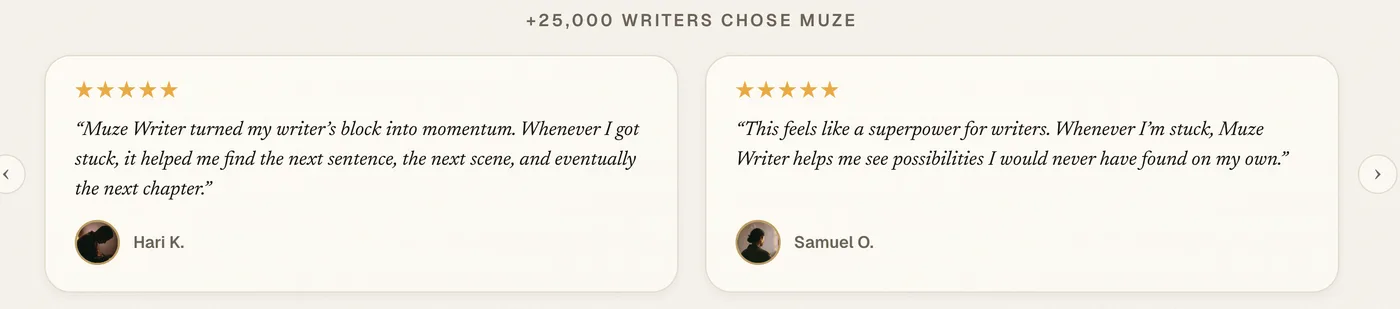
When Claude (mostly Claude Code and vibe-coded apps) is left to pick colours, commenters say it reaches for purple or indigo as the brand colour and for blue-to-purple gradients on hero sections, heading text and CTA buttons, often on a dark background with soft neon glows. It rarely comes alone: people name it in the same breath as Inter, a centered hero, three rounded feature cards and emoji icons, and they treat the colour as the fastest single tell of the package. Many commenters say it is the generic AI-website look rather than something only Claude does, and some trace it to Tailwind's indigo defaults; it is Claude-specific mainly because Claude is the tool most people build with and because Anthropic's own frontend-design skill bans 'purple gradients on white'. Through 2026 the reports describe it increasingly in the past tense: newer Claude output and Claude Design are said to have moved to cream, peach/orange, teal or emerald, so 'purple' is now partly a label for whichever saturated default accent plus glow the model leans on.
How people spot it · people naming each sign
Real cases, as posted
 12345
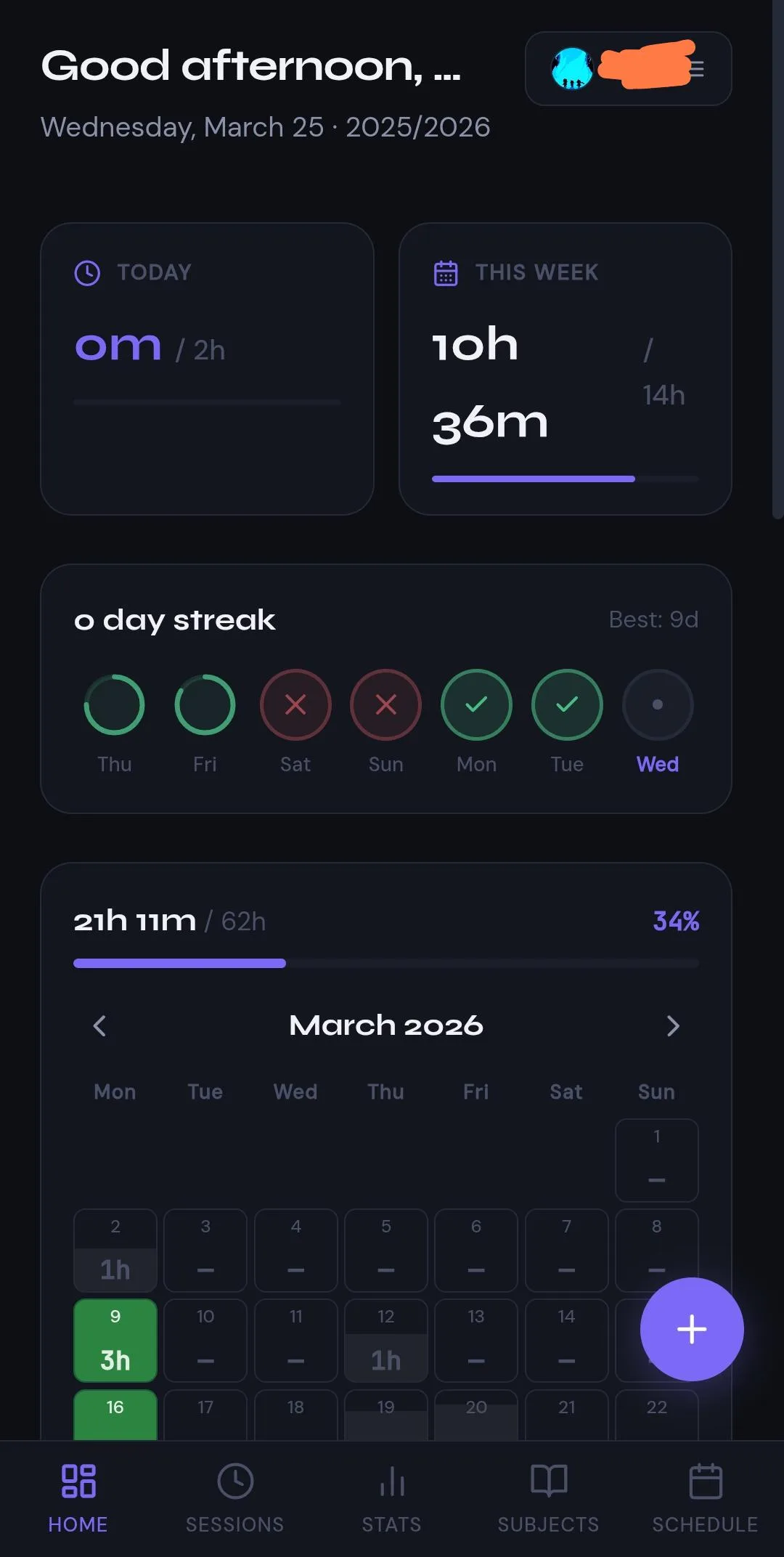
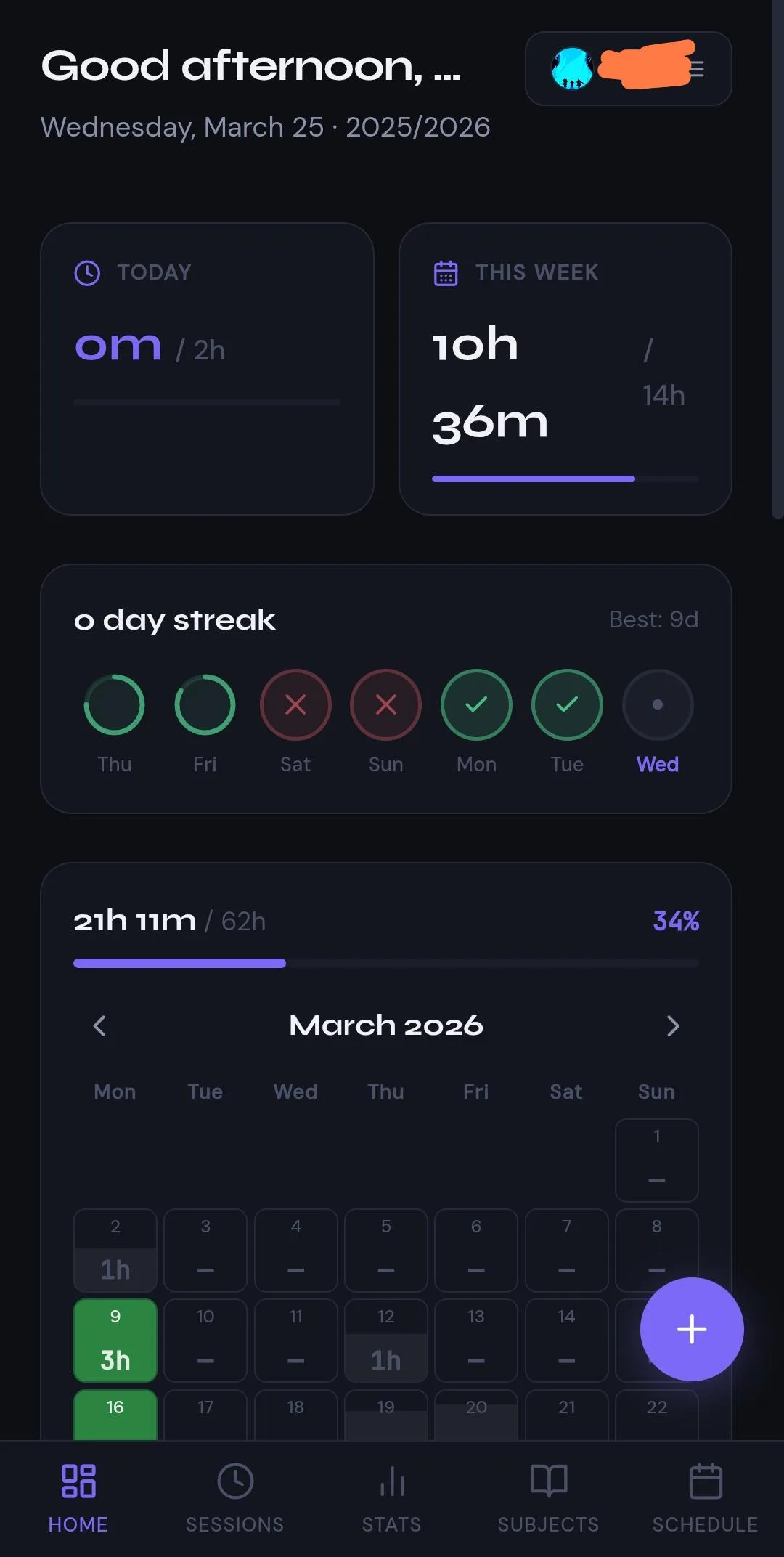
12345- 1Violet stat number
- 2Violet progress bar
- 3Violet percentage
- 4Glowing violet action button
- 5Violet active tab
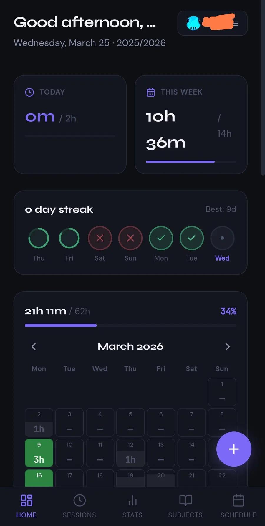
A competent dark study-tracker screen where one violet does all the accent work: numbers, progress bars, active tab and the floating button; replies name 'the prominence of purple'.
clearly Claude: OP says 'my app created with Claude' and 'This specific style was created by Clyde' · open thread
 1234
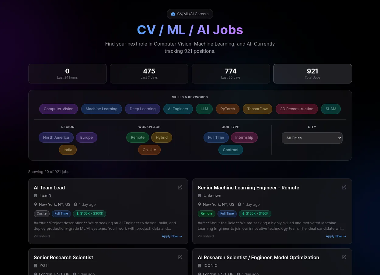
1234- 1Blue-to-violet gradient headline
- 2Purple corner glow
- 3Pill badge above heading
- 4Rainbow pastel chips
A clean, usable job board whose headline is a blue-to-violet gradient over a purple corner glow, with a pill badge above and rainbow pastel filter chips; a commenter says Opus defaults to exactly this.
probably Claude: attribution is the commenter's ('claude models especially opus like to default to rainbox theme with that specific gradient header'); OP does not name the tool · open thread
 123
123- 1Blue-to-violet gradient bar
- 2Glowing gradient icon
- 3Faint navy glow background
A polished onboarding screen: a blue-to-violet gradient progress bar and a glowing gradient icon on near-black, exactly the 'brightly colored vivid components on a dark background with some glow or gradient' the poster describes.
probably Claude: the poster built it with 'Lovable and Claude Code' and does not say which made this screen · open thread
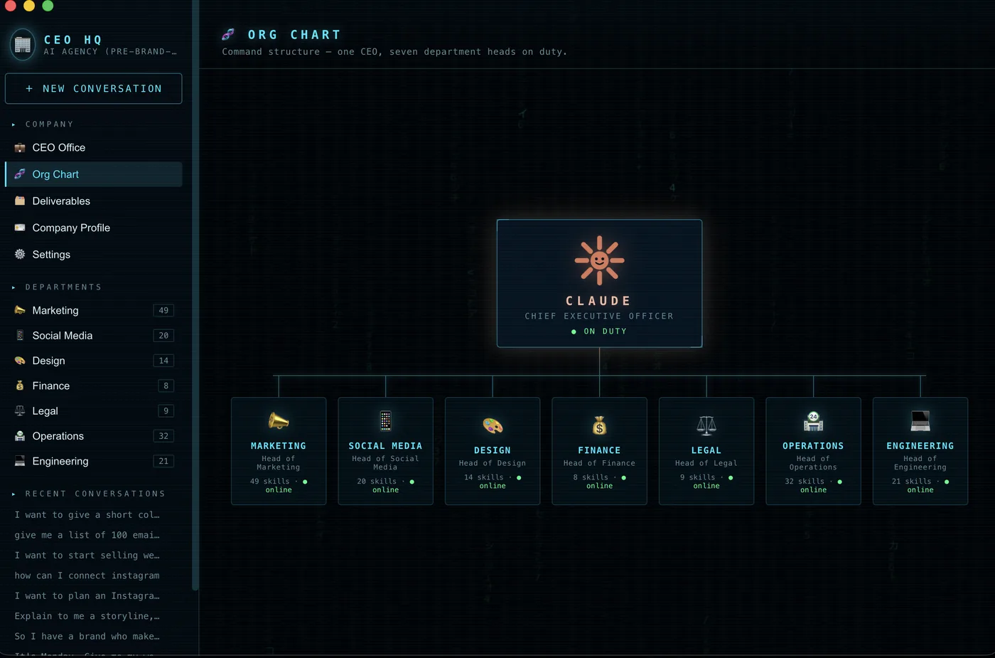 1234
1234- 1Glow around central card
- 2Cyan wide-spaced caps
- 3Emoji as icons
- 4Green status dots
A neat agent dashboard built with Claude in the dark-neon variant: cyan spaced caps, glowing card, emoji icons; the reply says it looks 'like something opus 4.1 would produce with the purples and blues', though the hue here is cyan rather than violet.
clearly Claude: OP says the interface was built 'using Claude'; the model guess (Opus 4.1) is the commenter's · open thread
Easily confused with
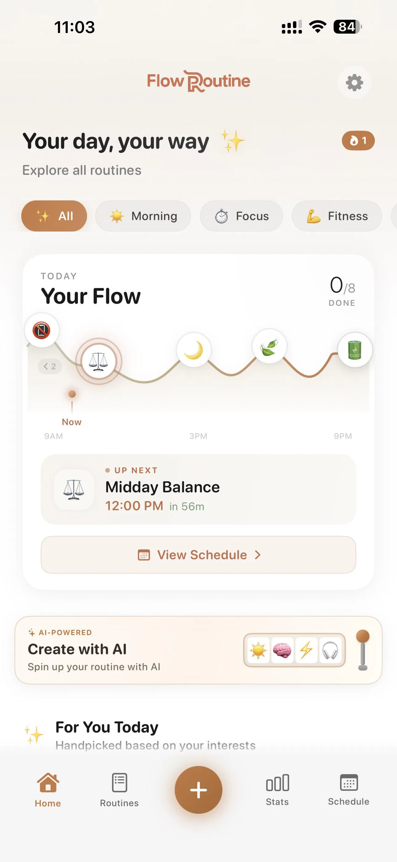
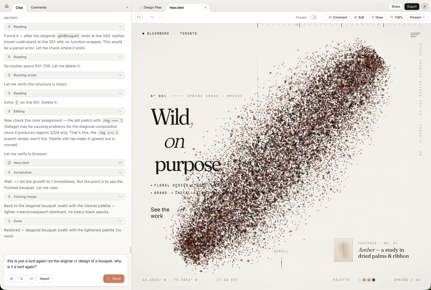
- Claude's newer warm look (cream background, terracotta/orange, serif with one italic word). That is the 2026 Claude-specific default; purple is the older, cross-model AI default that people now describe in the past tense.
- Generic shadcn/Tailwind dark dashboard. Neutral zinc/slate cards with no colour statement; the purple tell needs the saturated violet accent or blue-to-purple gradient.
- Emerald/teal 'skills' look. Same dark-with-glow recipe but the accent is emerald or teal, attributed to frontend skills and Claude Design rather than to the base model.
What it is not
- Many say it is the generic AI/Tailwind look, not Claude's own: Tailwind indigo defaults and 2019-2023 startup branding are blamed.
- One commenter argues it comes from post-training and style skills, not from the training-data average.
- Gradients themselves are defended; the type and style of gradient is what gives it away, and some people genuinely like the purple-blue palette.
- Some users chose purple themselves as their brand colour, so purple alone is a weak signal.
- A side-by-side test in July 2026 found no purple gradient in any of 12 Claude runs, with or without the frontend-design plugin.
Over time
- People say the purple era is ending or over: 'Used be blue purple gradients', 'Before it was blue/indigo gradients, now it's warm peachy background + bright orange'.
- In February a commenter already assumed newer models had the purple trained out.
- Claude Design is credited with knowing not to use purple gradients, but is said to have its own teal/cream defaults.
- Green is increasingly named with or instead of purple: 'neon colors especially purple and a cyber green', 'neon and lime green text'; a March 2026 post calls emerald 'the new purple' after design skills spread.
- Orange tint and glow are now named for Claude sites (September 2026).
- A July 2026 re-run of 12 Claude pages found no purple gradient at all.
 12345
12345 12345
12345 12345
12345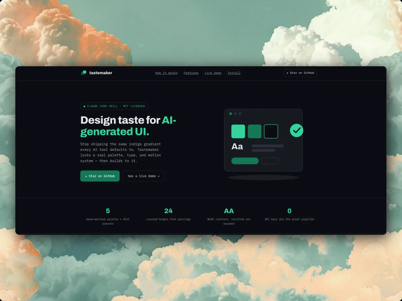 12345
12345 1234
1234 12345
12345 12345
12345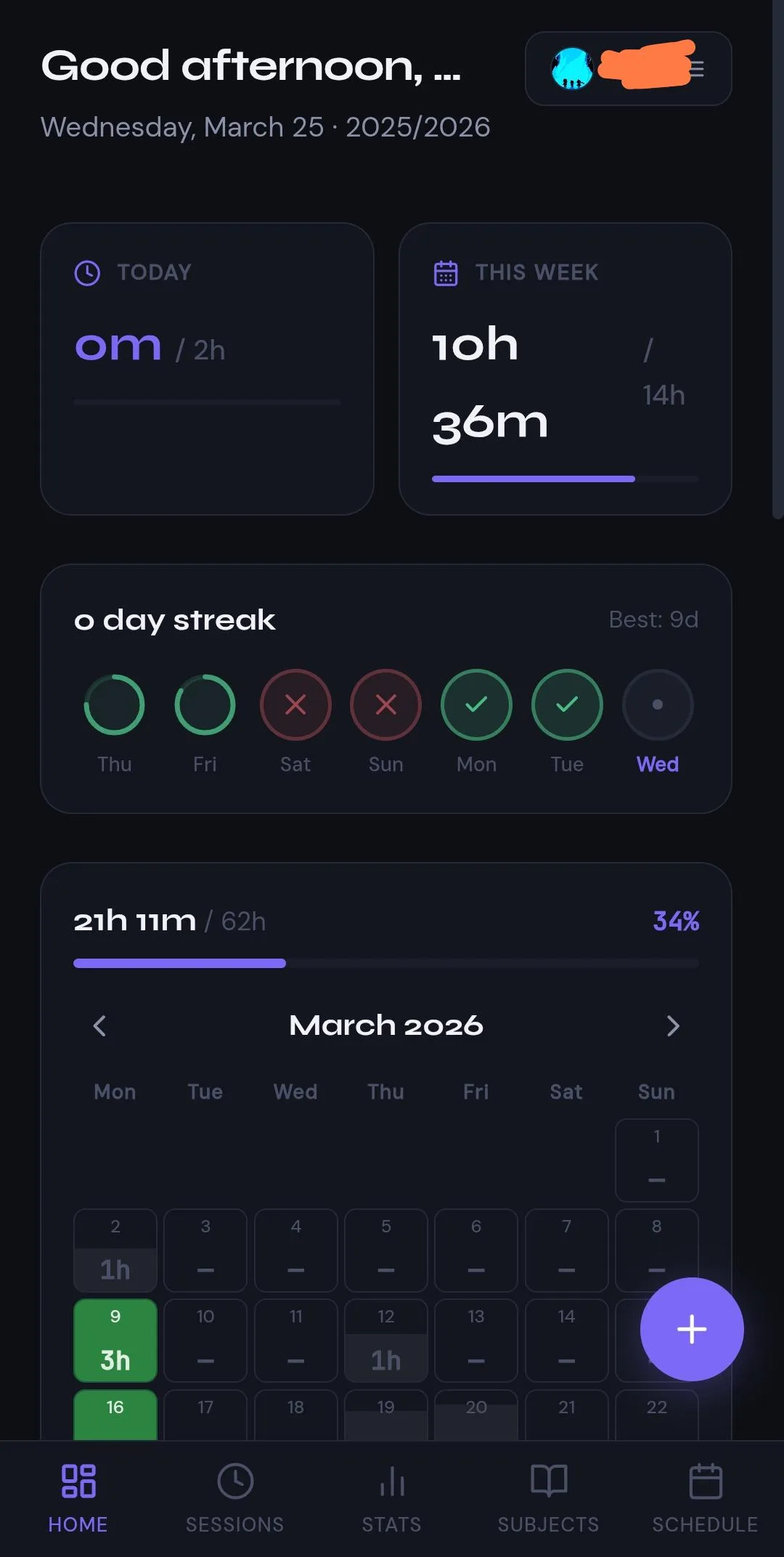 1234
1234 1234
1234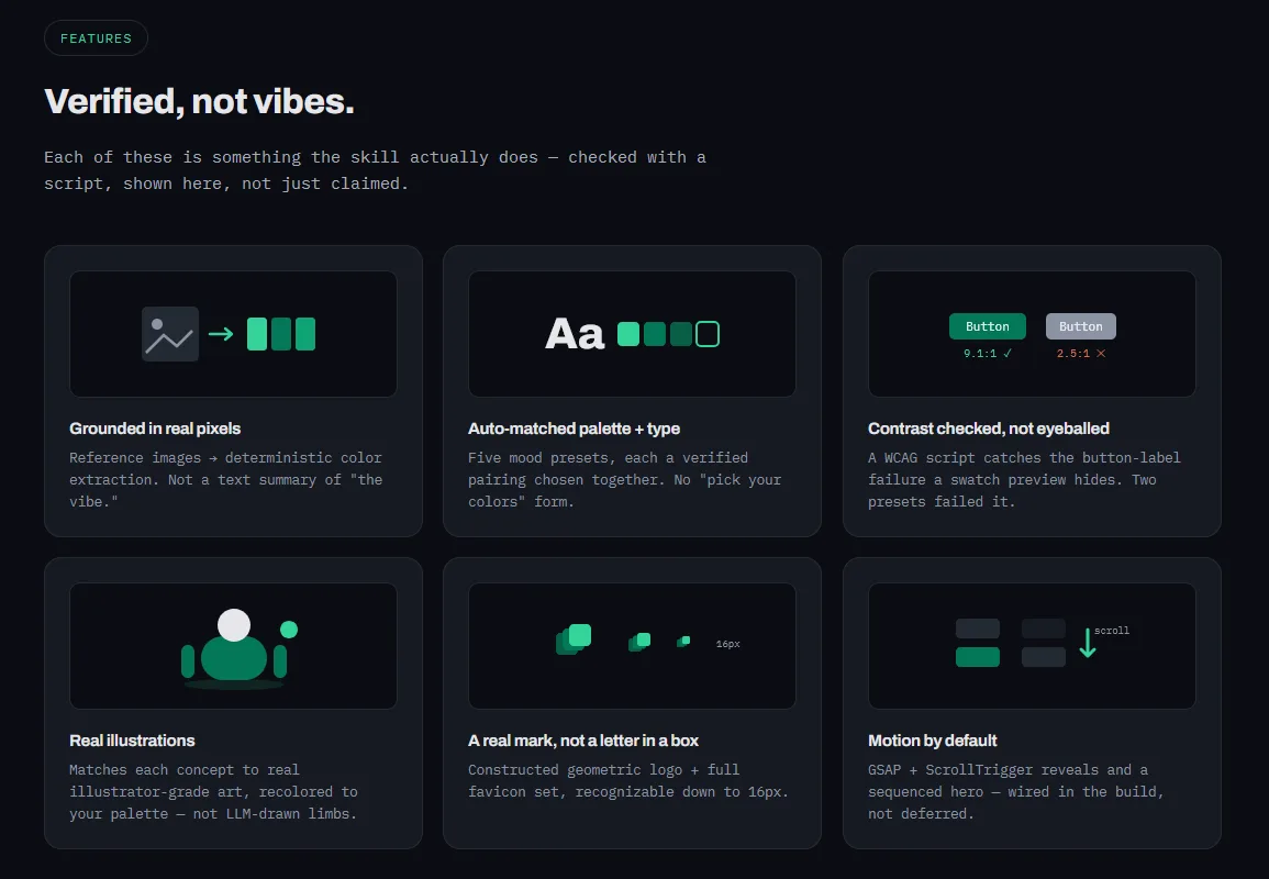 1234
1234 123
123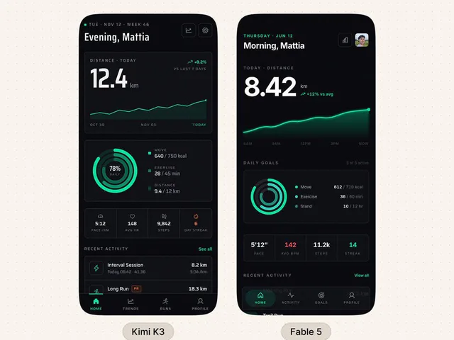 123456
 123456
 123456
 12345
12345 12345
12345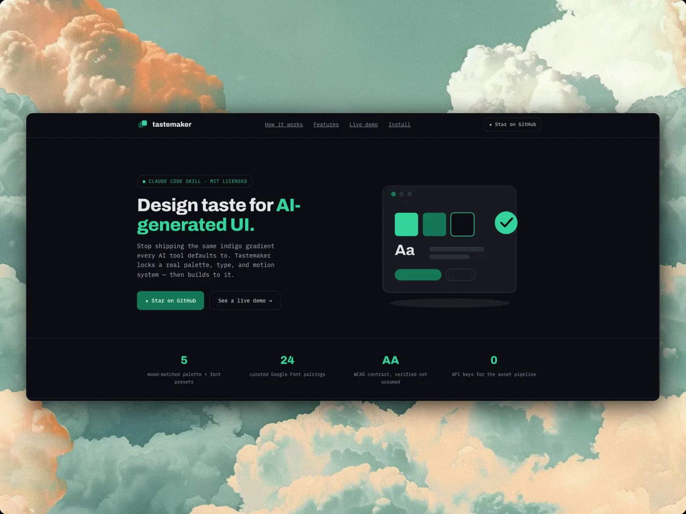 1234
1234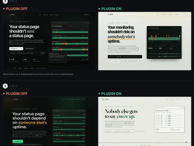 12345
12345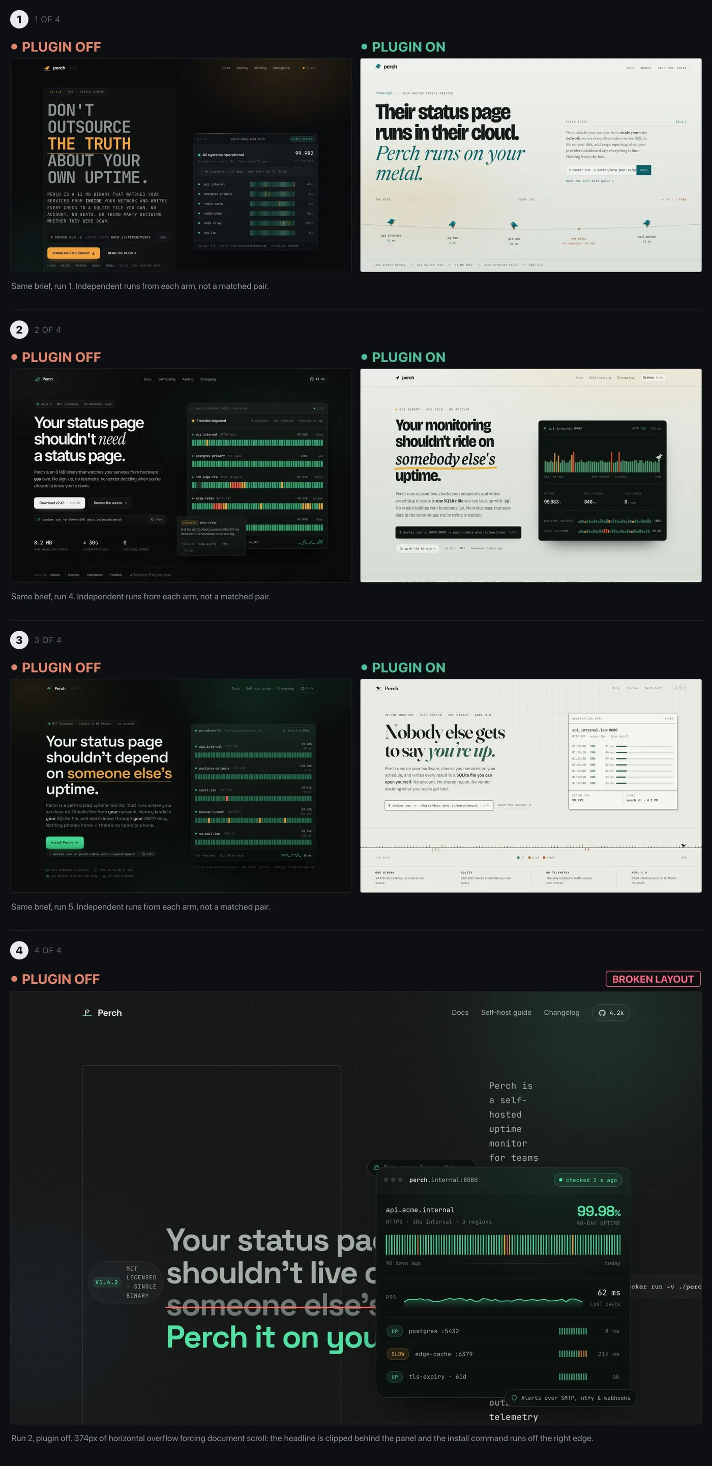 12345
12345 12345
12345 123456
 1234
1234 1234
1234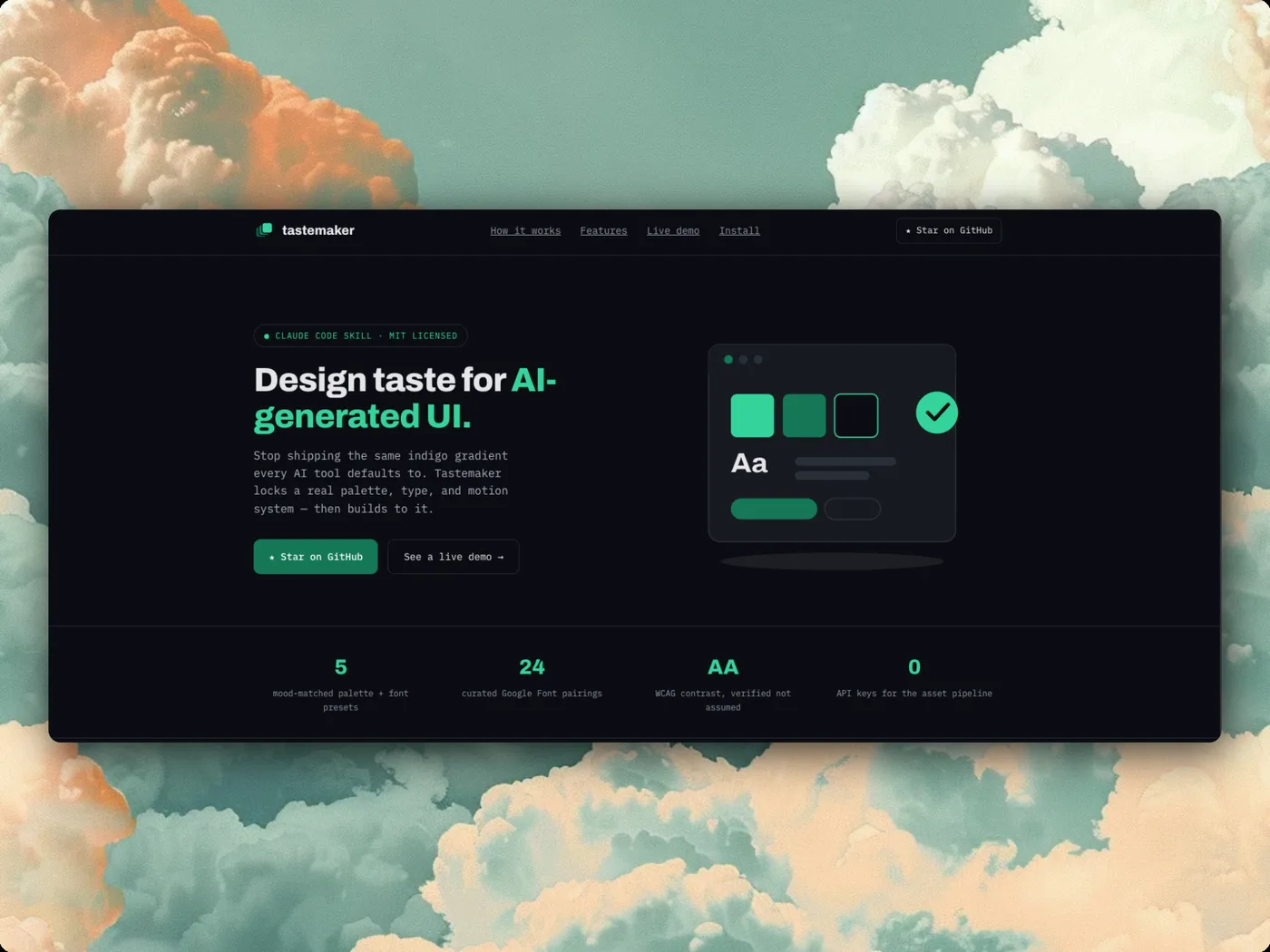 1234
1234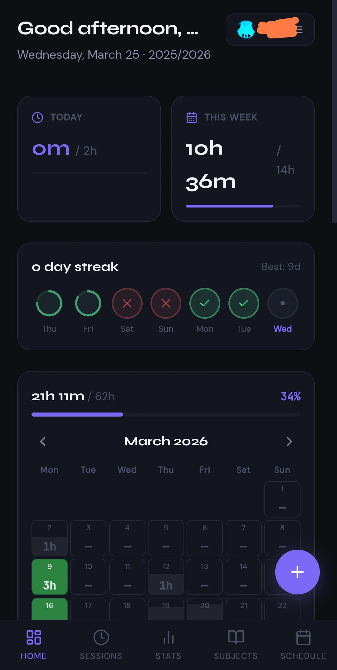 1234
1234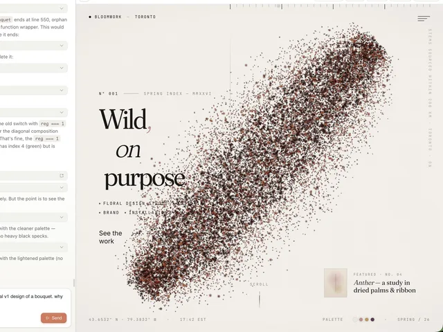 123456
 123456
 123456
 1234
1234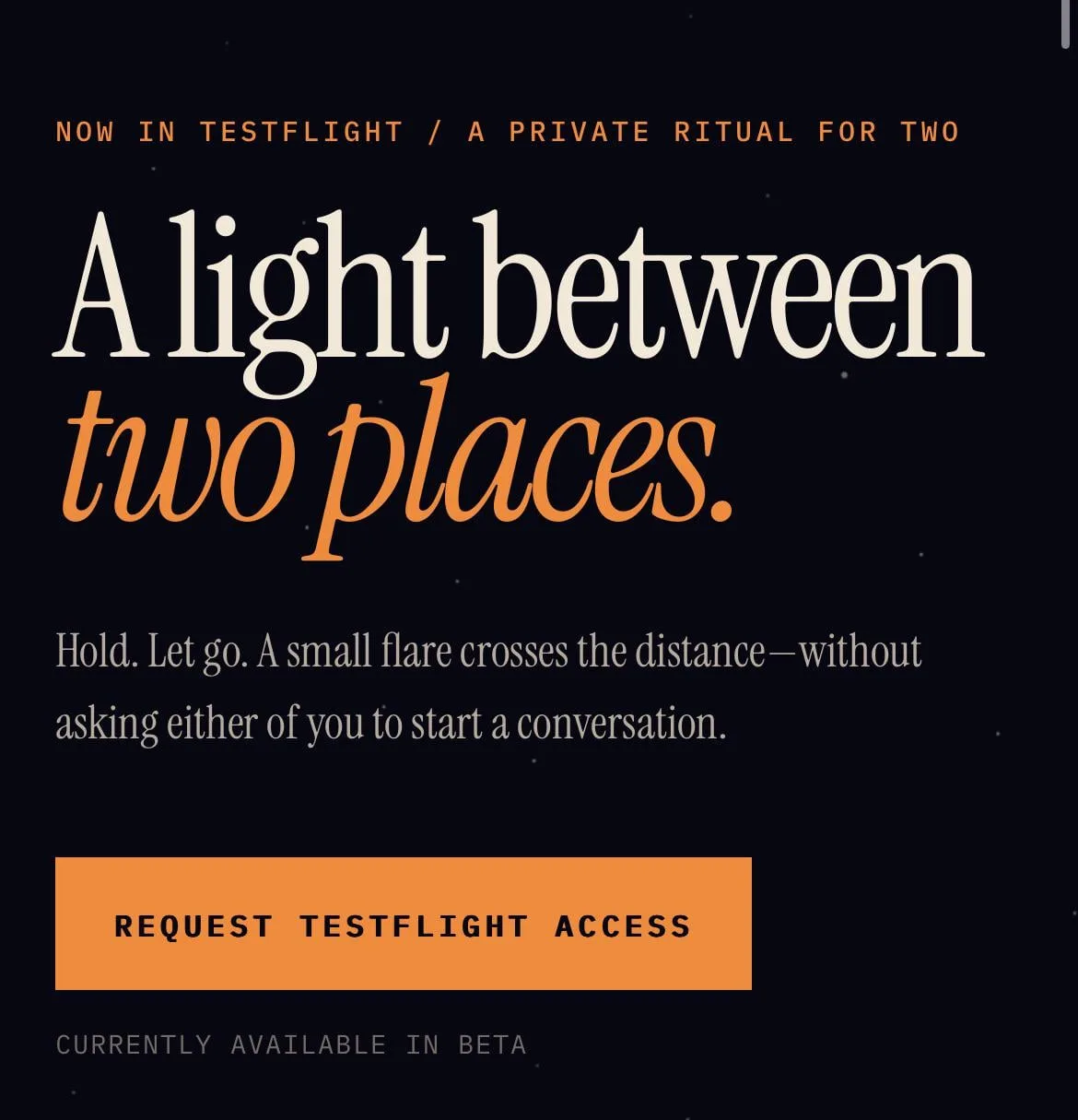 1234
1234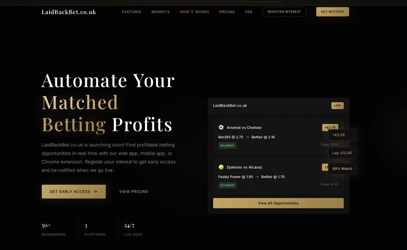 1234
1234 1234
1234 1234
1234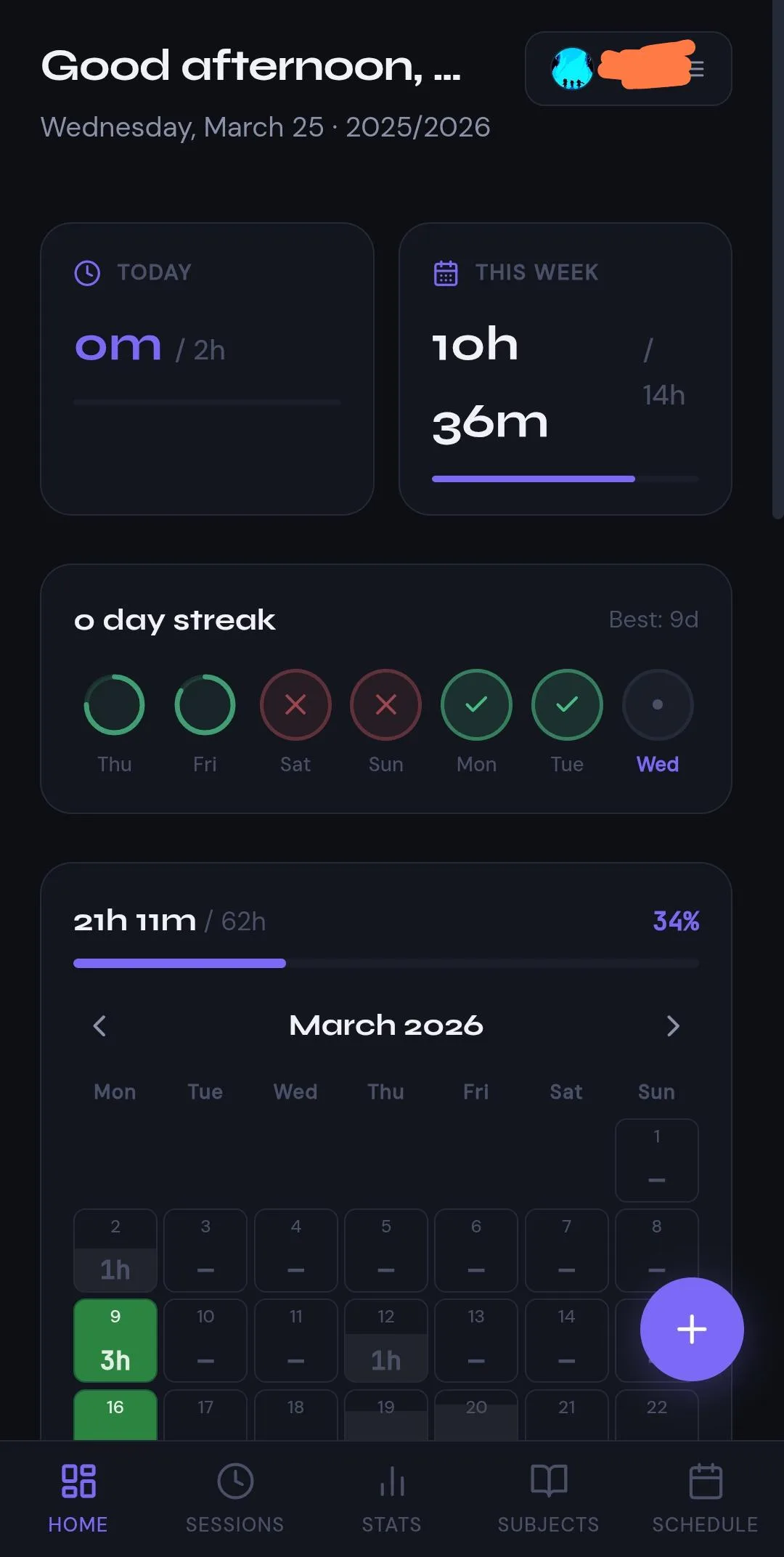 1234
1234 1234
1234 1234
1234 1234
1234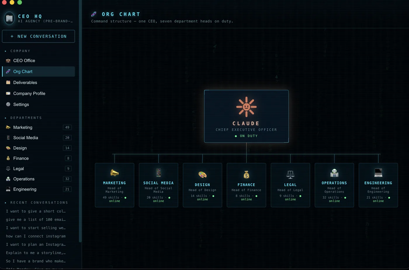 1234
1234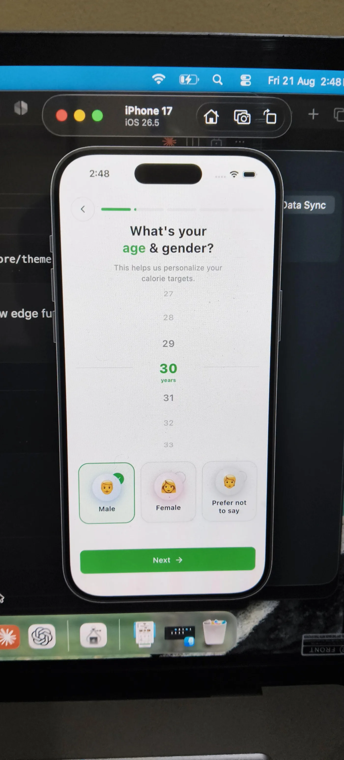 123
123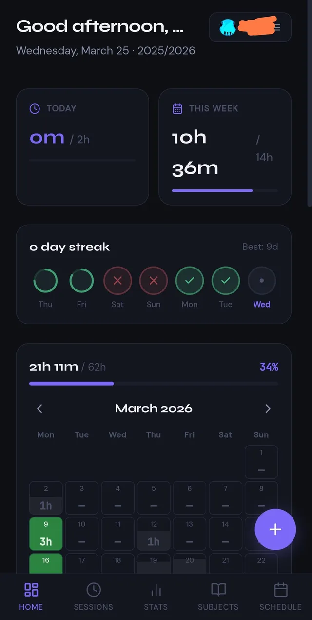 1234
1234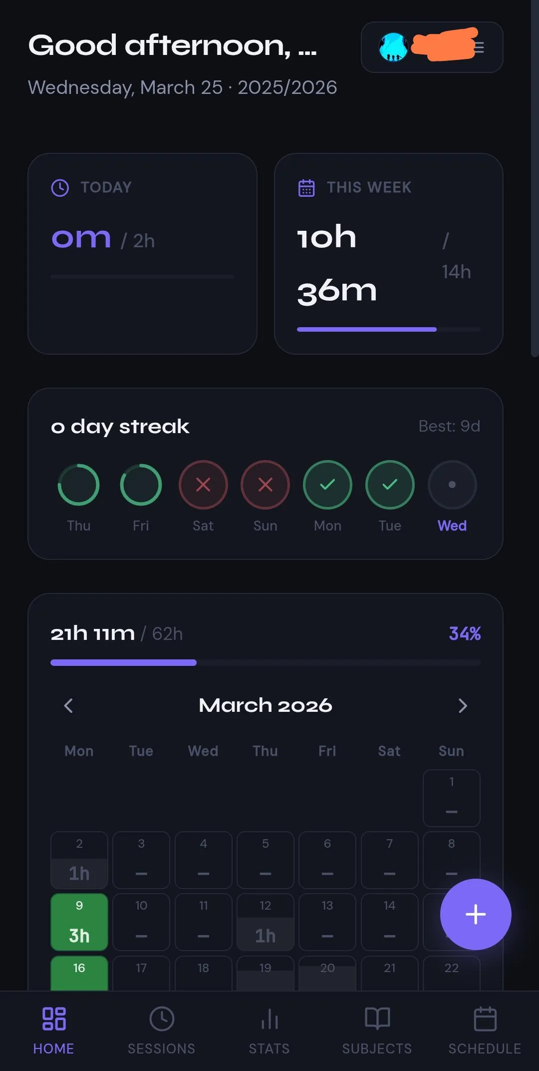 1234
1234 1234
1234 1234
1234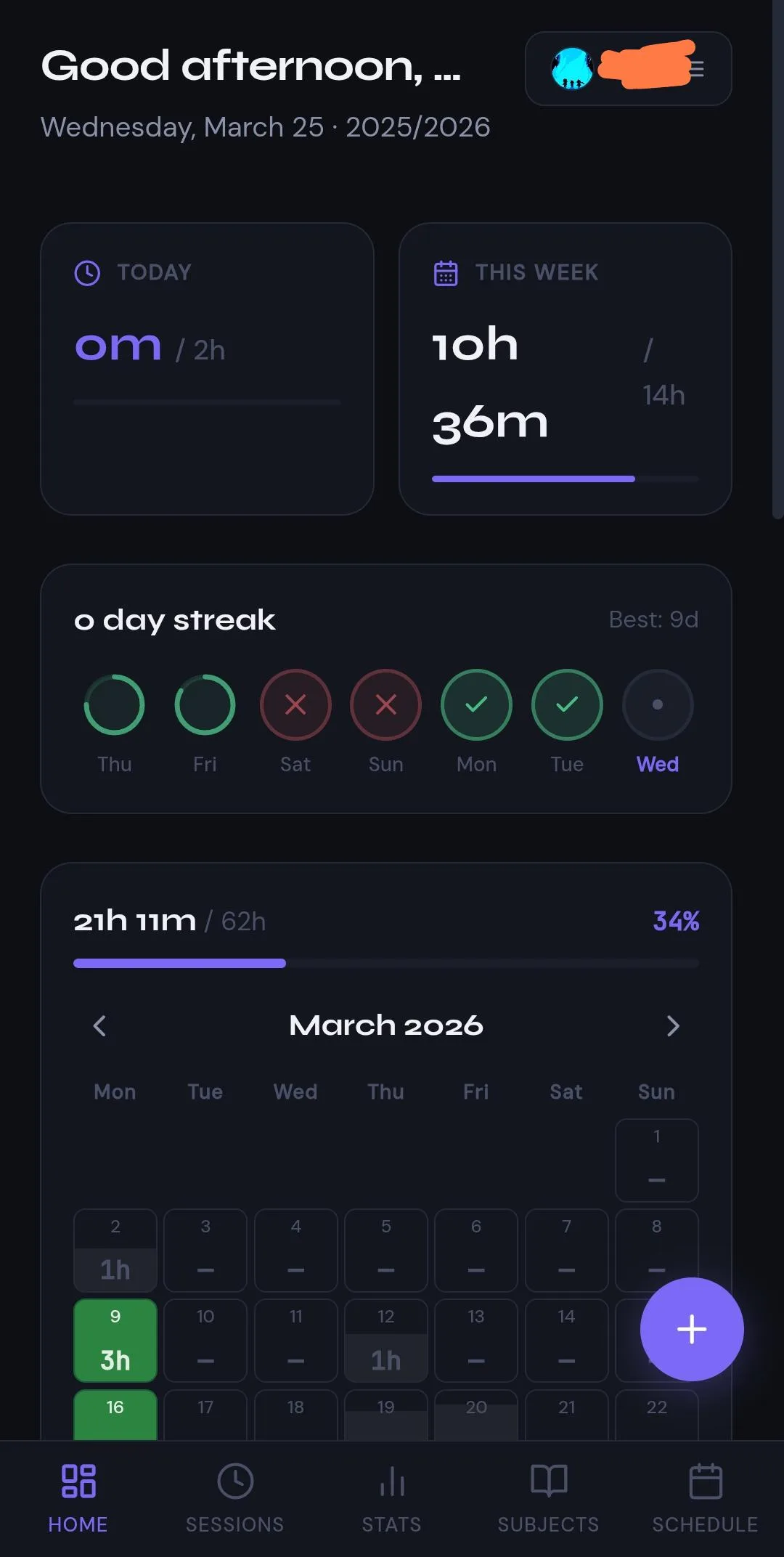 12345
12345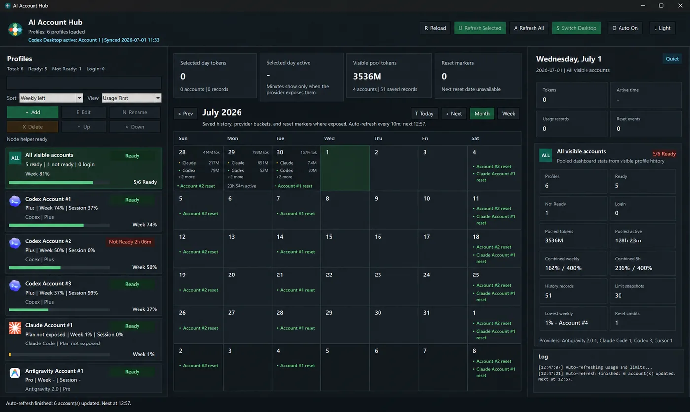 1234
1234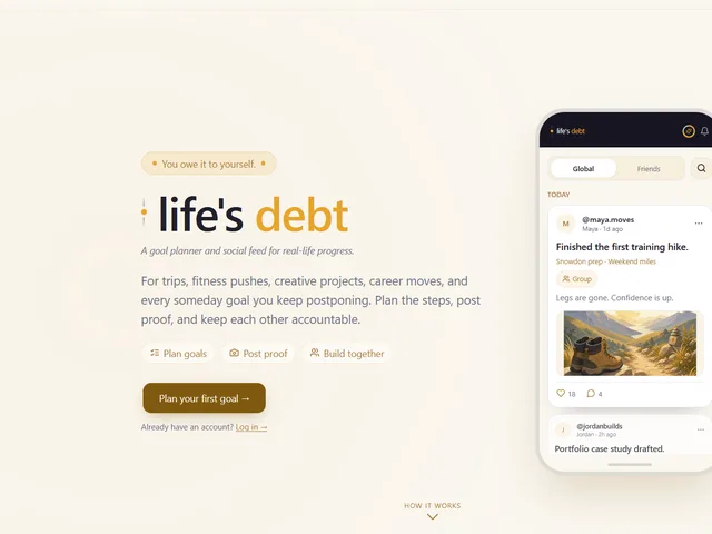 1234
1234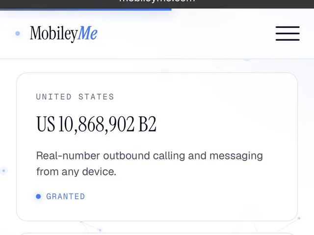 123
123 123
123 123
123 123
123 12
12 12
12 12
12 12
12 1234
1234 1
1 1
1 1234
1234 1234
1234 1
1 12
12 1
1 12345
12345 12345
12345 1234
1234 1
1 12
12 12
12 1234
1234 1234
1234 1
1 1
1 12345
12345 1234
1234 12345
12345 1234
1234 123
123 123
123 1234
1234 1234
1234 123
123 123
123 123
123 123
123 1234
1234 123
123 1234
1234 123
123 123
123 1234
1234 1234
1234 123
123 123
123 123
123 12
12 123
123 123
123 1234
1234 1234
1234 1234
1234 1234
1234 1234
1234 1234
1234 12
12 12
12 123
123 123
123 123
123 123
123 123
123 123
123 1234
1234 1234
1234 1234
1234 12
12 12
12 12
12